
Hive Brands
Optimizing the Autoship Experience
Making recurring purchasing easier to discover, understand, and adopt
- UX Strategy
- Research
- Prototyping
Overview
Turning a hidden option into a clear purchase decision
Hive Brands was an e-commerce marketplace for sustainable household and grocery products. Customers could buy products individually or choose to “Subscribe & Save” - Hive’s recurring autoship program.
Autoship was critical to the business, but the shopping experience did little to encourage opt-in: subscription options were easy to overlook, savings were poorly communicated, and the cart assumed customers had already made the decision on the product page.
I led the UX strategy and hands-on product design, identified the cart as a high-leverage opportunity, and partnered with product and engineering to improve discovery and conversion.
Results
in autoship opt-in rate
(9.5% → 21.6%)
in autoship revenue
(21% → 37%)
The Opportunity
Redesign the cart to champion a business-critical UX decision so we aren’t relying on customers discovering the value proposition of Autoship earlier

Key Design Decisions
- 1
Elevate autoship interactions
Treat autoship opt-in as the hero, not a secondary checkbox, without undercutting the checkout rate.
- 2
Clarify a product’s autoship status
Show Subscribe & Save versus One-Time Purchase clearly for every product, especially in mixed carts.
- 3
Communicate monetary value
Pair discounts and strikethrough prices with the autoship decision so the benefit is immediate.
- 4
Reduce competing priorities
Preserve secondary promotions while de-emphasizing anything that obscures the primary autoship decision.
The Solution
Redesigning the decision architecture
Elevated Autoship from a secondary option to a primary cart decision
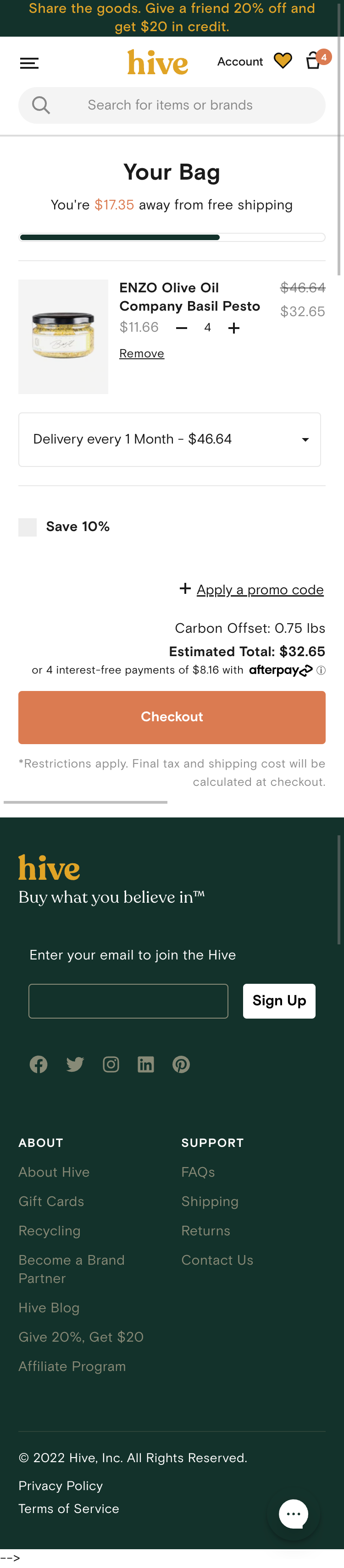
Before the redesign, the gift with purchase content block took up an extremely large share of screen real estate and overwhelmed the top of the cart page. Conversely, the option to subscribe all products in the cart was very visually deprioritized and presented at the bottom of the order summary - additionally, the Autoship opt-in was only presented as a savings discount without any connection to the subscription commitment.
I adjusted the prominence of all content so that the cart's most important decisions - purchase type, products, total, and checkout - had clearer hierarchy while preserving all valuable promotional program messaging.
The redesigned cart page had to balance several promotional approaches that had various degrees of importance to both the business and its customers - my design actually managed to keep the free shipping tracker and gift with purchase promotions at the top with the choice to move the Autoship opt-in action.
The new Autoship block clearly pairs the subscription commitment with the 10% savings as well as unlock the ability to choose the shipping frequency.


Product tiles were upgraded to work harder
Before, the choice of whether an product was set for Autoship or a one-time shipment was hidden inside a dropdown.
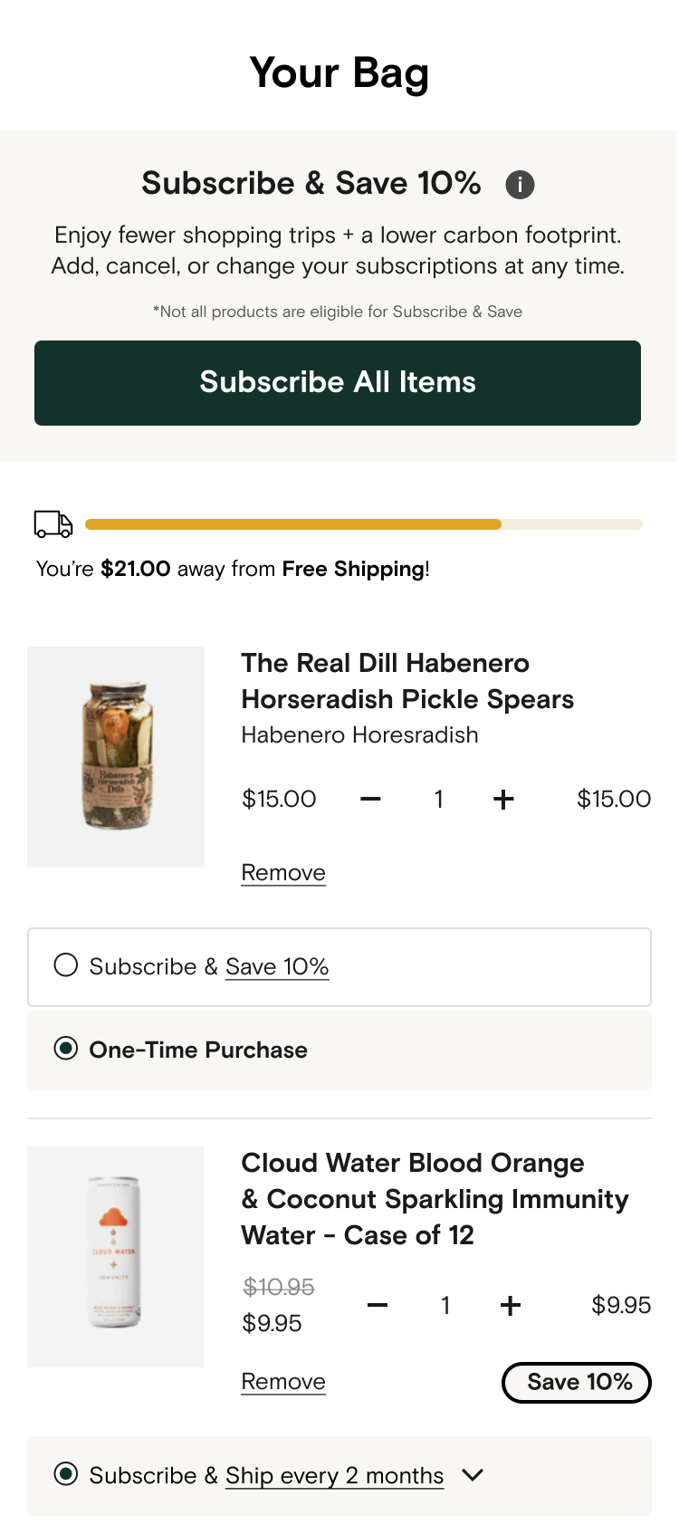
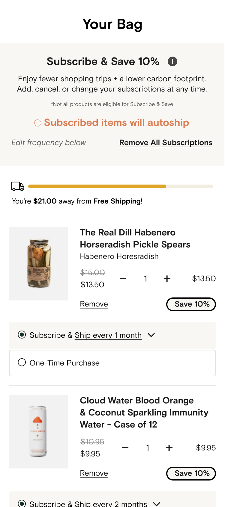
The redesign exposed clear Subscribe & Save and One-Time Purchase controls on the individual product level as well as connected the Autoship commitment to its economic benefit through clear pricing and savings badges.

What We Learned
Shifting autoship opt-in rate had downstream effects
Higher Autoship opt-in rates exposed a comprehension problem users were having - “Created by accident” became a meaningful cancellation reason, and support contacts and cancellations rose alongside adoption.
This shifted our focus to messaging clarity, autoship management, and retention which informed subsequent work on autoship benefits & calls to action, the Autoship portal, and return user flows.
Iteration
Simplify & refine the opt-in decision
The first redesign offered multiple frequency choices but 1-month frequency continued to be the most popular. This later iteration replaced the 4 autoship options with a single “Subscribe All Items” CTA, making the primary decision clearer by indicating the action explicitly and faster by aligning with the default frequency set on the product detail page.
Designed while directing user experience at Hive Brands
Back to Portfolio