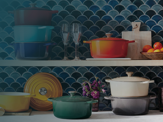
Colorful Le Creuset cookware displayed against blue tile

Le Creuset

Redesigning for a Storied Brand

Upgrading and modernizing to create a best-in-class shopping experience for a heritage brand

2020 Redesign

  • Creative Direction
  • UX Strategy
  • Research

Overview

Showcase brand creativity and support ecommerce fundamentals

In 2019, Le Creuset engaged Blue Acorn to redesign and replatform its ecommerce experience from Magento to Salesforce Commerce Cloud. I served as Creative Director and UX Lead, leading research, experience strategy, and UX design while directing a mid-level UI designer who developed the visual execution.

Before design began, I led the UX research and synthesis effort to understand where the existing experience was helping or hindering an already strong ecommerce business. The work combined quantitative site and funnel analysis, customer feedback, competitive research, moderated user studies, and persona development. The goal was to identify where customer behavior and business opportunity overlapped before we committed to a design direction.

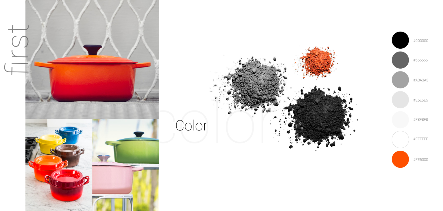
At the same time, we were effectively creating Le Creuset’s digital design language from the ground up. The usable web brand guidance consisted of just three colors—black, white, and Le Creuset orange—two typefaces, and logo standards. The redesign therefore had to establish both a scalable ecommerce experience and a visual system capable of expressing the brand’s defining ideas: color, quality, craftsmanship, and heritage.

Results

2020

Site launched on Salesforce Commerce Cloud, creating a more scalable, mobile-first ecommerce foundation centered on stronger product discovery, decision support, and brand storytelling

The Opportunity

Make a premium cookware assortment easier to understand and shop without sacrificing the richness of the Le Creuset brand

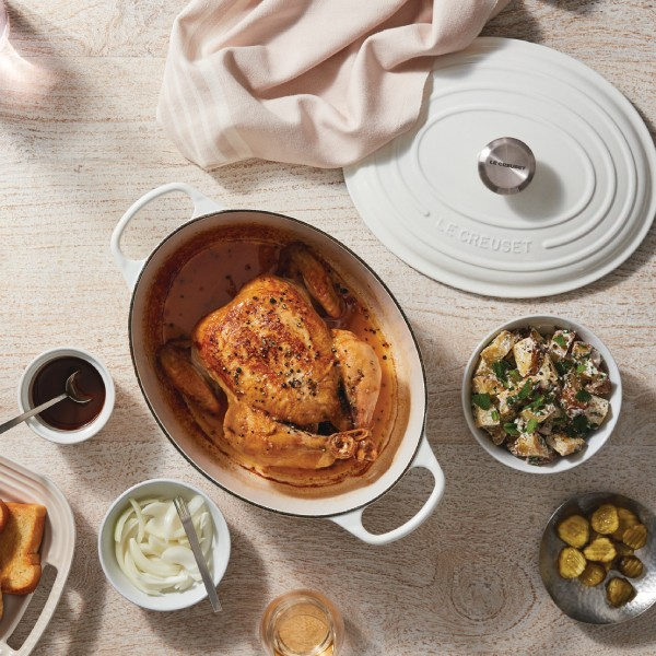
Le Creuset cookware and prepared food on a table

Le Creuset’s ecommerce business was already growing. Traffic, conversion, and revenue were trending positively, and mobile represented roughly 57% of sessions while growing faster than desktop. The research therefore pointed toward optimization rather than recovery: preserve what was working while removing friction that could constrain continued growth.

The most significant funnel opportunity appeared before checkout. Only about 9% of PDP exposures led to add-to-cart, while 79% of users who added a product progressed to checkout.

Research helped explain why - customers admired Le Creuset’s products but often had difficulty understanding materials, sizes, benefits, specifications, warranties, and use cases.

The Solution

Designed around product understanding, not just product browsing

Grounded in research

I created the UX Blueprint that brought together site analytics, funnel performance, customer survey data, competitive analysis, moderated usability research, and user archetypes.

The research showed that the biggest opportunity was helping shoppers make sense of the assortment.

Customers needed clearer answers to questions like:

  • Which material is right for me?
  • What size should I buy?
  • How are similar products different?
  • What can I cook in each piece?
  • Why is Le Creuset worth the investment?

User research validated what the brand thought about themselves - customers value Le Creuset’s quality and unique color choices. Le Creuset lovers will build collections around color stories. Regardless of how they feel about the price of Le Creuset’s products, the brand is viewed as aspirational and worth the price due to its heritage.

“You get what you pay for!! I originally bought a Lodge cast-iron skillet as a gift for my husband because it was $70 cheaper, but it was awful! ... invest in a brand that’s excellent and will last you a lifetime!!”

Key Design Decisions

  1. 1

    Prioritize mobile-first

    Mobile already represented the majority of sessions and was growing faster than desktop, so page layouts and interactions were designed with that in mind.

  2. 2

    Redesign for the biggest funnel opportunity

    We invested heavily in product understanding, configuration, and confidence to impact add-to-cart rates.

  3. 3

    Conventional commerce + differentiated brand

    A solid platform allowed us to adopt more recognizable ecommerce patterns for filtering, configuration, cart, and checkout while reserving custom experience design for true brand differentiators.

  4. 4

    Content integrated into decision-making

    Education, care, materials, sizing, recipes, and heritage were positioned as conversion tools, not supplemental marketing or bolted-on afterthought content.

A minimalist digital design system

Because there was almost no inherited digital design language, the design system for the user interface had to be defined as part of the redesign itself.

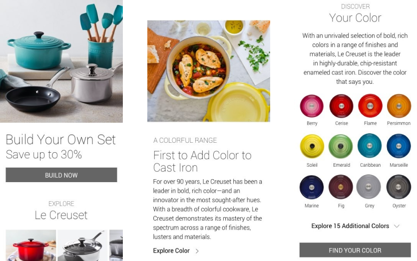
Working closely with Le Creuset’s Creative Director, I directed a visual strategy that kept the interface intentionally restrained and allowed product photography and color to carry the brand. The UI designer translated that direction into the visual execution and reusable page patterns.

This was not a brand redesign. It was the work of translating an established physical and editorial brand into a scalable digital commerce system where almost no web-specific guidance existed.

Le Creuset digital design system showing typography, color, and photography

Color became a true commerce behavior

Color was already one of Le Creuset’s strongest emotional differentiators. Customer feedback repeatedly referenced the appeal of the brand’s colors, and the competitive research showed that “Shop by Color” had unusually strong engagement when customers found it.

But the existing experience did not always preserve a shopper’s selection consistently. The redesign treated color as a functional product attribute across discovery and configuration—not merely as visual merchandising.

We explored clearer color filtering, product-based swatches, persistent selection between PLP and PDP, and more usable ways of displaying Le Creuset’s large color assortment.
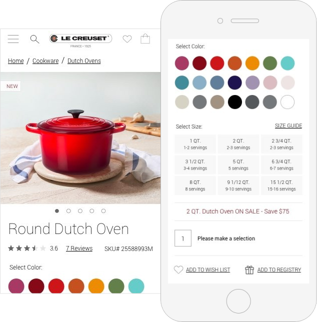
Le Creuset product page with color selection controls
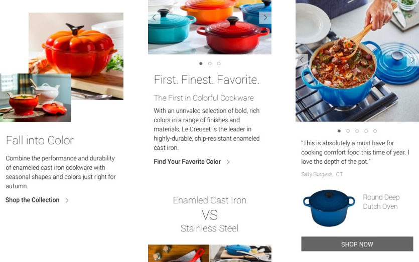
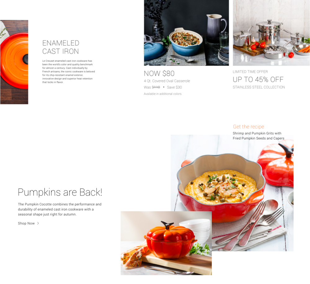
Le Creuset editorial content and product imagery

Content reinforced the premium purchase decision

The survey and interview work showed that customers already believed Le Creuset represented quality and long-term value. They often understood the price as an investment rather than an arbitrary premium.

The redesign therefore focused on making the evidence behind that perception more visible: product construction, materials, craftsmanship, care, warranty, versatility, recipes, and brand history.

Rather than separating editorial and commerce content, we integrated education throughout the shopping journey so content could actively help customers choose and buy.

Created while directing user experience at Blue Acorn

Back to Portfolio