
Le Creuset
Optimizing Mobile Shopping
Researching solutions that improve conversion and customer satisfaction
- Design Lead
- Research
- Prototyping
Overview
Alleviate user painpoints within pages critical to the shopping journey
As part of an ongoing optimization engagement with Le Creuset, I took ownership of UX improvements for an existing ecommerce experience that had been designed prior to my involvement.
Mobile represented an important opportunity. Customers were encountering long, content-heavy shopping pages that made it difficult to efficiently browse products, understand differences between options, and evaluate individual items.
Rather than beginning with a visual redesign, I used behavioral data, heuristic analysis, and user research to identify where the mobile experience was creating the greatest friction—and developed targeted improvements to the Product Listing and Product Detail experiences.
Results
UX audit · Analytics analysis · Heatmap analysis · User testing · Concept development · Interaction design · Mobile ecommerce optimization
The Opportunity
Improve the mobile experience while building a research-backed case for design changes
The primary goals were to:
- Make product browsing faster and more efficient on smaller screens
- Improve the presentation of product imagery, colors, materials, sizing, and other decision-making information
- Reduce unnecessary page length and interaction friction
- Validate design recommendations with customer behavior and user research rather than relying on UX convention alone
- Establish opportunities for incremental optimization within the constraints of the existing Le Creuset website
Key Design Decisions
- 1
Improve assortment scanability
The proposed Product Listing page gained visual color swatches and moved to a two-column mobile product grid, allowing customers to understand available options at a glance.
- 2
Let product imagery do more selling
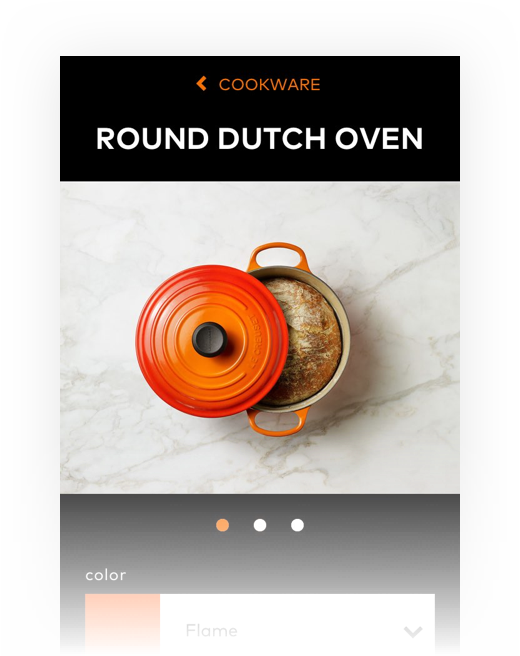
A more familiar swipeable mobile gallery leading with lifestyle imagery allows customers to naturally move between images without leaving the primary product experience.
- 3
Reduce page length without removing useful information
I restructured the Product Detail page to make the most decision-critical information immediately accessible while allowing secondary content to remain available without dominating the experience.
- 4
Remove friction and reinforce purchase confidence
Order and hierarchy of content prioritized the information customers needed to understand the product, evaluate their options, and feel comfortable moving forward.
The Solution
Finding the highest-friction moments in the shopping journey
I began by auditing the existing mobile experience against established ecommerce usability heuristics and reviewing Hotjar heatmaps to understand how customers were interacting with individual pages.
I combined these observations with quantitative analysis from Google Analytics. Looking across the shopping funnel revealed two particularly important opportunities: Product Listing Pages and Product Detail Pages.
The analytics gave us evidence of where customers were struggling, while the heuristic review and behavioral data helped explain why.
User testing was then used to challenge my assumptions, uncover additional pain points, and validate whether the issues identified through analytics were affecting real customers in the ways we expected.
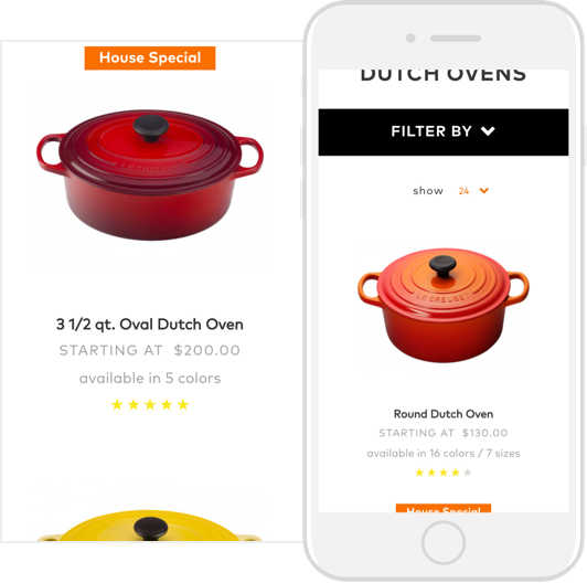
Before: Product browsing required too much effort
Product Listing Pages had a bounce rate of more than 50%.
The existing single-column mobile layout displayed relatively few products within the viewport and created an exceptionally long browsing experience. Important differentiators such as available colors were also communicated primarily through text rather than visually.
User testing reinforced the problem. One participant summarized the experience simply:
“In real life, I would not scroll this much to find what I was looking for.”
The research suggested that customers needed a way to assess a larger portion of the assortment more quickly without sacrificing the product details necessary to make a selection.
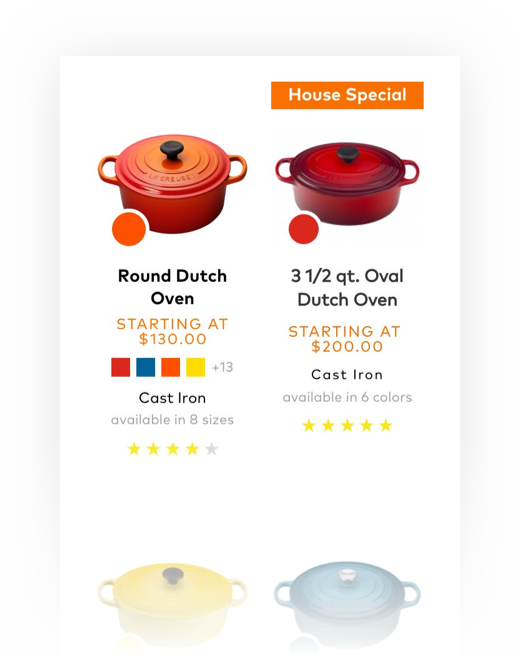
After: A refined product listing page that differentiates products
The proposed Product Listing Page moved from a single-column layout to a two-column mobile grid, reducing page length by approximately 50% and allowing shoppers to compare more products with less scrolling.
I also made key product differences easier to scan by replacing text-based color options with visual swatches and refining the product-card hierarchy to more clearly distinguish price, options, and attributes such as material.
Together, these changes created a faster, more visually intuitive browsing experience while helping customers recognize the transition from broad category browsing to a more focused product assortment.
Before: Product pages weren’t encouraging exploration
Product Detail Pages presented a second major drop-off point. Approximately 67% of sessions exited without additional engagement.
The existing experience relied heavily on text and required extensive scrolling through product information. Product imagery also made it difficult to quickly understand characteristics such as scale, color, and how the product might look in a real environment.
One participant captured the disconnect particularly well:
“The shopping experience feels lacking because I love the products.”
For a highly visual and distinctive product like Le Creuset cookware, the digital shopping experience was not communicating the richness of the physical product particularly effectively.
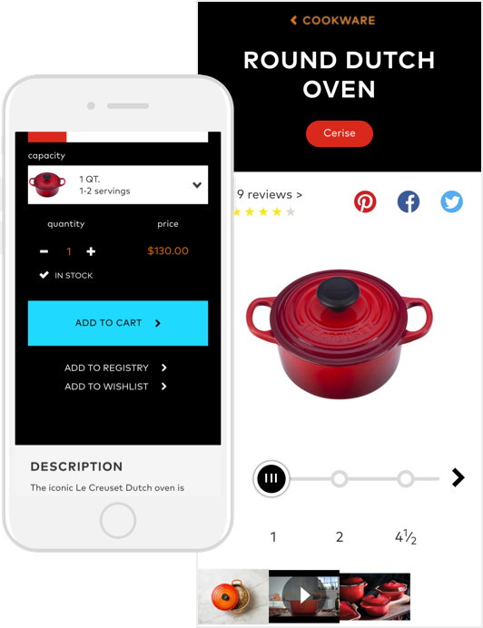
After: Product pages celebrate what makes Le Creuset products great
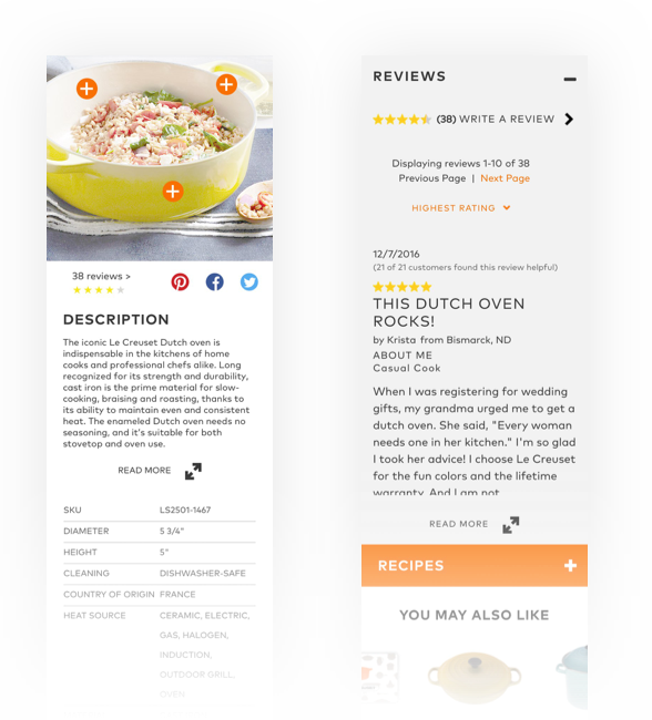
Product Detail Page improvements focused on making the experience more visual, scannable, and easier to navigate. I replaced the existing modal image interaction with a more familiar swipeable mobile gallery and explored leading with lifestyle imagery to better communicate product scale and context. Long sections such as Description, Reviews, and Recipes were partially or fully collapsed to reduce page length and create a clearer hierarchy between purchase-critical information and secondary content.
I also adapted the desktop Explore experience for mobile, using interactive hotspots to communicate product features more visually and reduce reliance on dense text. Additional refinements included removing lower-value elements like the size slider from the initial viewport and surfacing return information closer to the purchase decision to reduce clutter and improve customer confidence.
Validate design decisions rather than relying on preference
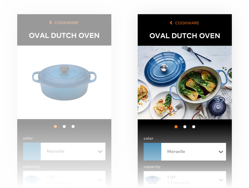
I tested customer reactions to two versions of the Product Detail Page: one beginning with a silhouetted product image and another beginning with a lifestyle image.
Users overwhelmingly preferred the lifestyle imagery because the environmental context helped them better understand characteristics such as product size and scale.
The finding gave us direct customer evidence for a design decision that could otherwise have been treated as purely aesthetic.
Designed while working at Blue Acorn
Back to Portfolio