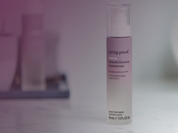
Living Proof haircare products arranged on a lavender background

Living Proof

Restyle & Re-Platform

Building a research-backed ordering and pick up experience

2018 Redesign

  • Design Lead
  • UX Strategy
  • Prototyping

Overview

Communicate Living Proof’s distinctive scientific position in haircare

Working with Living Proof at Blue Acorn, we undertook a full ecommerce redesign and replatforming project coinciding with an evolution of Living Proof’s brand identity. The work combined quantitative analytics, competitive analysis, customer research, collaborative UX workshops, wireframing, high-fidelity design, and the creation of a reusable UI library.

The central design challenge became balancing beauty, science, education, and commerce: creating an experience polished enough to reinforce Living Proof’s premium positioning while making its scientific differentiation understandable and helping customers confidently determine which products were right for them.

Results

2018

Site launched on Salesforce Commerce Cloud, creating a more differentiated, educational and product-focused DTC experience

The Opportunity

Differentiate from sites selling the exact same product

The UX research uncovered two core customer needs: the site needed to create brand awareness and excitement as well as reassure customers that buying directly from Living Proof would offer enough additional value to justify their time and money.

That meant the website couldn’t behave like a conventional product catalog. It needed to become the place where Living Proof could tell the richest version of its story, explain the science behind its products, guide customers to the right regimen, and build confidence that the products could actually address their hair concerns.

The Solution

Elevate the B2C shopping experience to compete with national retailers

Refresh the brand to appeal to a growing audience

Living Proof was evolving its brand to feel more modern, expressive, and relevant to a younger demographic while retaining its clean, intelligent, science-led foundation. The redesign became an opportunity to translate that emerging identity into a cohesive digital commerce experience.

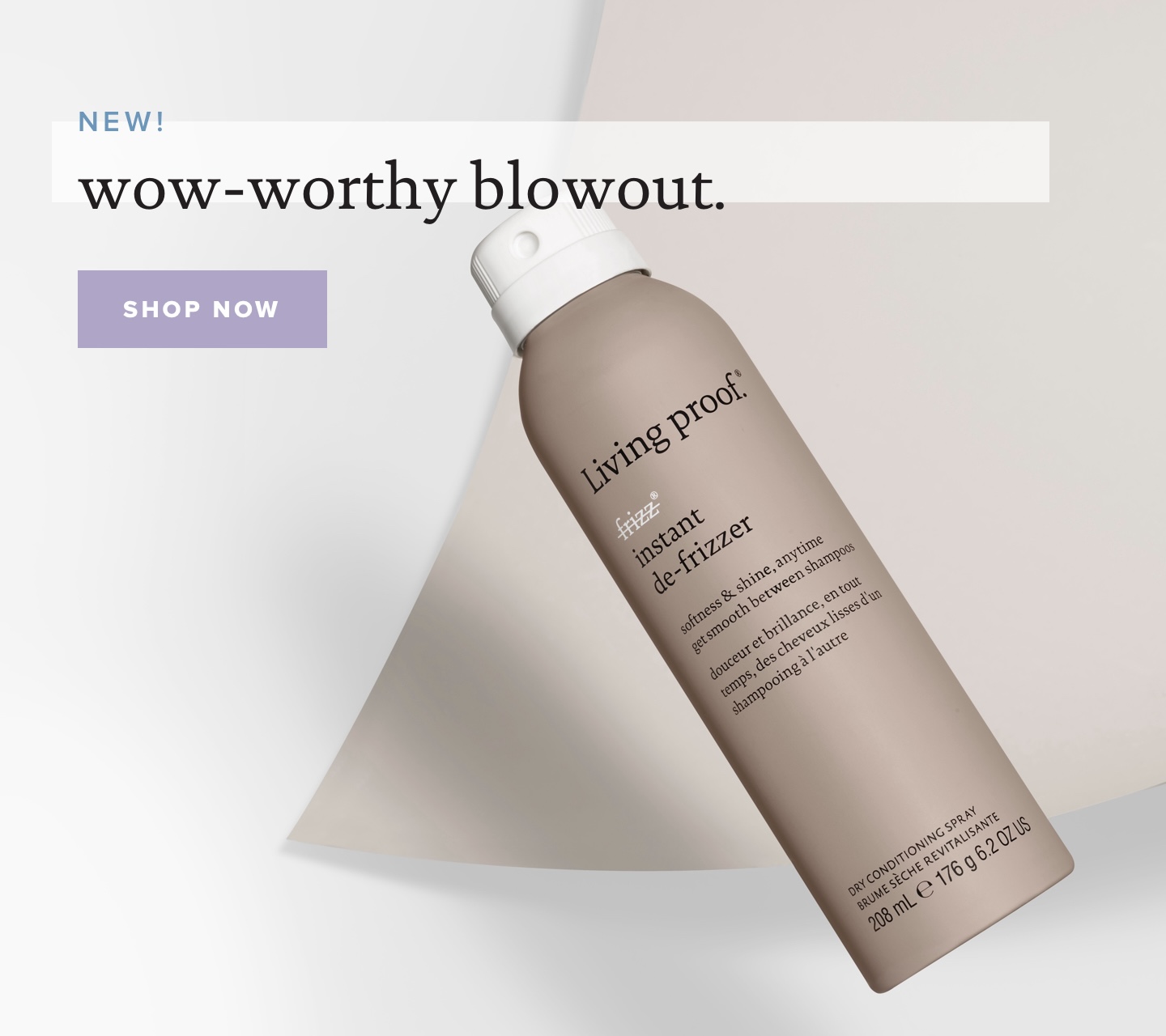
Living Proof visual stylescape with typography, photography, and color
Living Proof research and product exploration

Research uncovered product complexity

Research showed that customers were interested in Living Proof’s products but often weren’t sure which ones were appropriate for them:

“These products are interesting but I’m just not sure which one would work best for me…”

Customers needed clearer guidance on which products addressed their specific hair concerns and how products fit together within a routine. Strong engagement with search and the Hair Diagnostic Product Finder showed that problem-based discovery was a critical part of the shopping experience.

Grounding the redesign in customer behavior

To prepare for the UX workshop, we combined several forms of discovery rather than relying on competitive comparison alone. The research program included:

  • ecommerce analytics and funnel analysis
  • competitive benchmarking
  • expert UX evaluation
  • user testing
  • analysis of product browsing and search behavior

Research uncovered that helping customers discover products, understand their value and feel confident enough to purchase should be our biggest focus areas.

Living Proof collaborative UX workshop materials

Key Design Decisions

  1. 1

    Organize discovery by customer needs, not just the products

    Customers did not always know which Living Proof product line was best for them, so navigation needed to support browsing by hair concern, category and collection.

  2. 2

    Make education part of conversion

    The redesign integrated one of Living Proof’s strongest competitive advantages - scientific credibility - into product details throughout the shopping experience.

  3. 3

    Preserve depth without overwhelming

    Research favored product pages that appeared simple while still providing extensive detail when customers wanted it through progressive disclosure and structured sections for deeper content.

  4. 4

    Give customers a reason to shop direct

    Living Proof’s site had to offer something retailers could not: deeper expertise, better product guidance, richer storytelling and stronger confidence in what to buy.

Giving the brand a digital expression worthy of the product

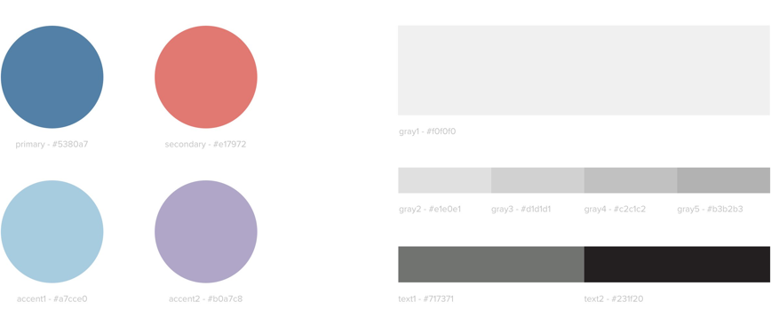
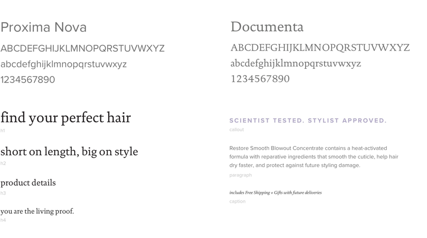
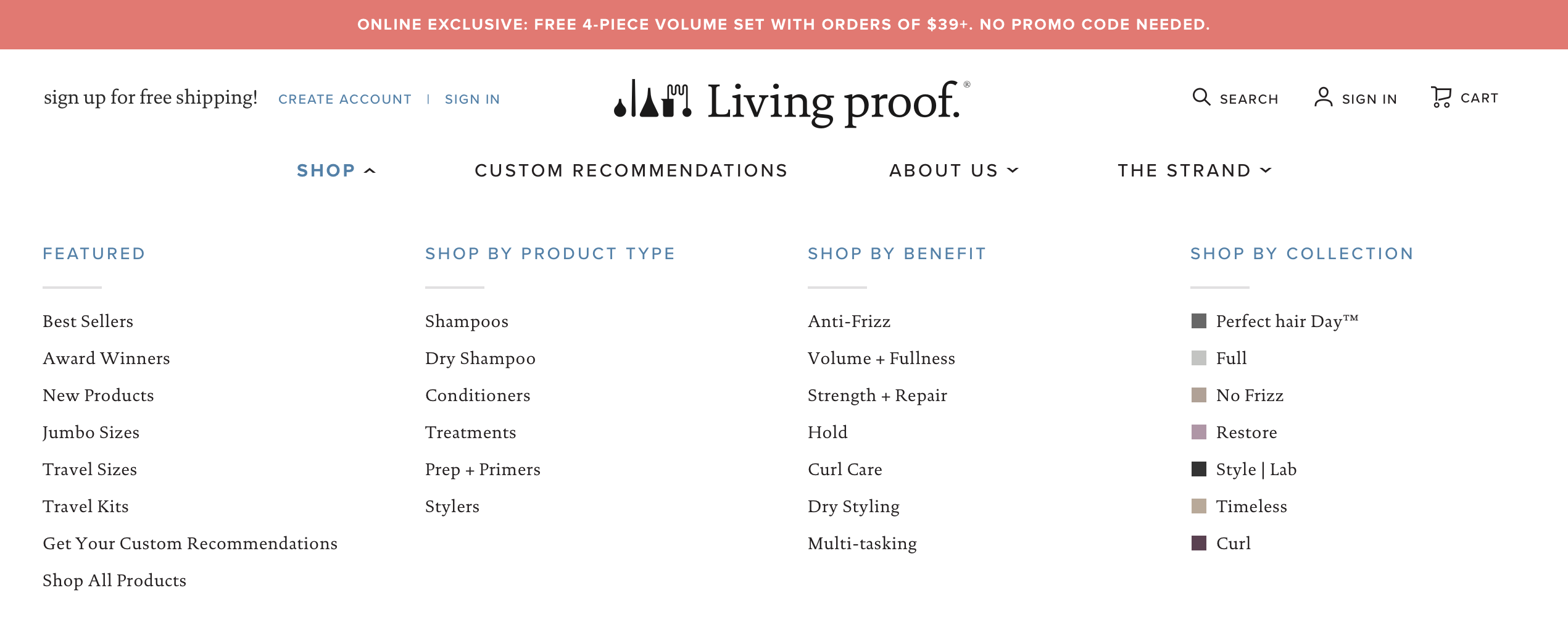
The visual styles in the UI Library I produced balance Living Proof’s scientific credibility with a more emotional, modern brand expression. I translated their previous identity direction of geometric structure, pastel color, diverse imagery, and generous whitespace into a cohesive ecommerce design system.

Living Proof typography and color UI libraryLiving Proof interface componentsLiving Proof ecommerce modulesLiving Proof product interface patterns
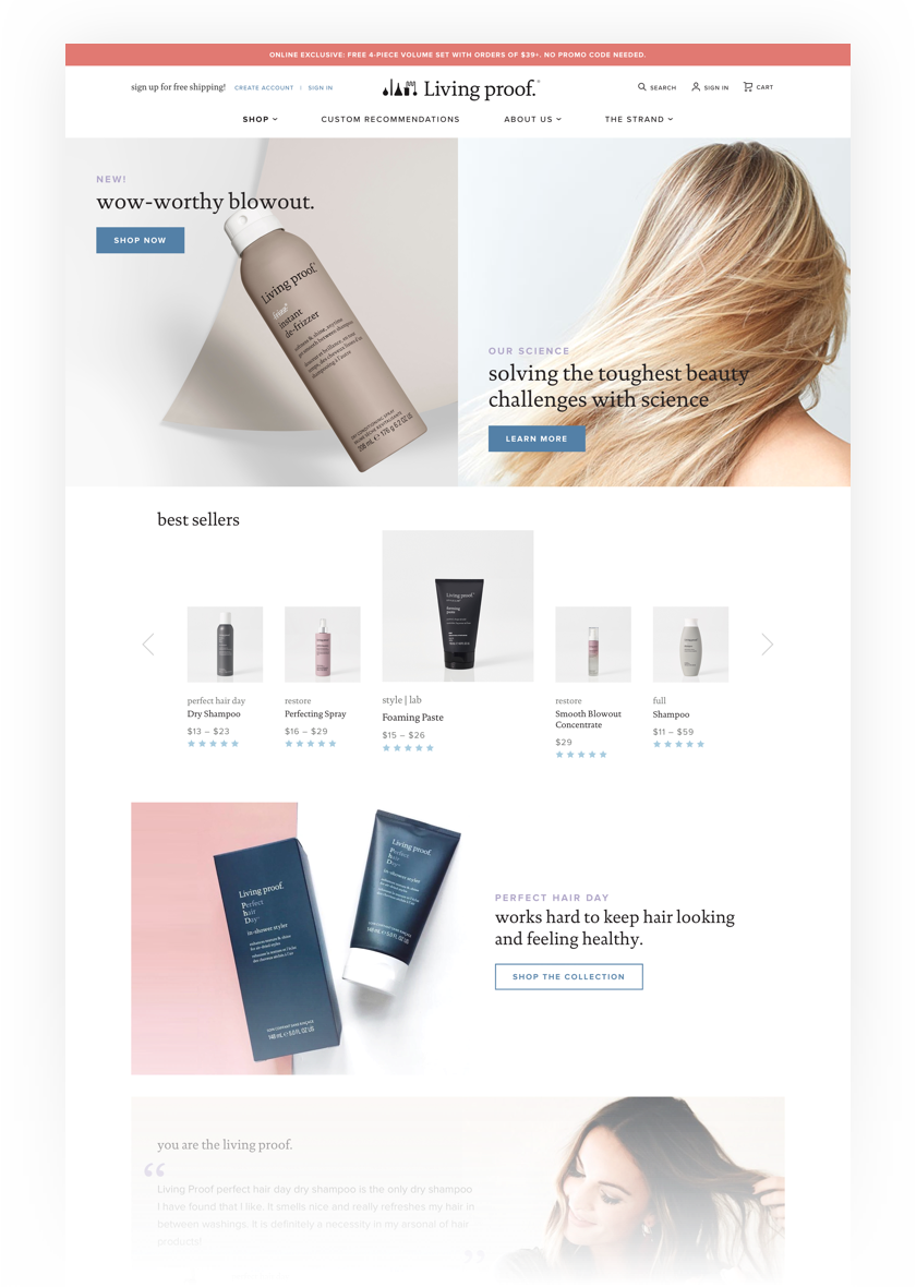
Living Proof high fidelity homepage prototype

Translating a design system into high fidelity prototypes

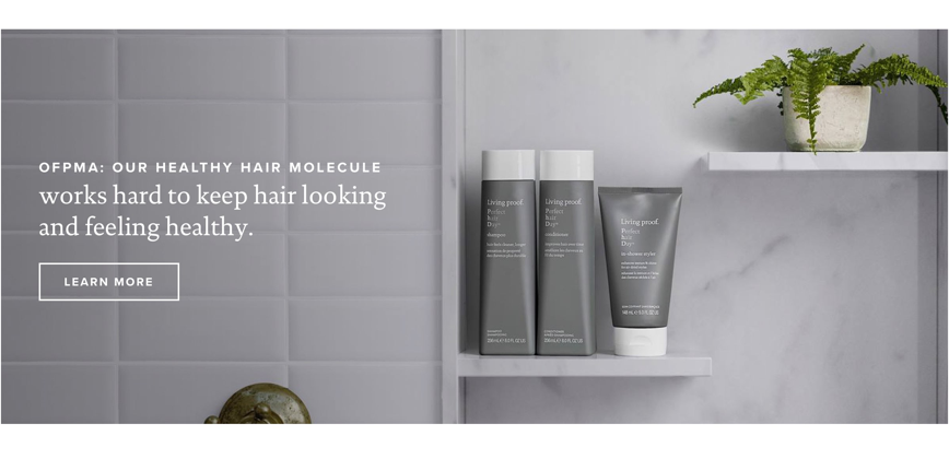
Structured layouts, editorial storytelling, product photography, and controlled use of color created a site that felt less like a retailer and more like an authoritative destination for solving hair concerns, supported by a reusable UI library for consistent implementation.

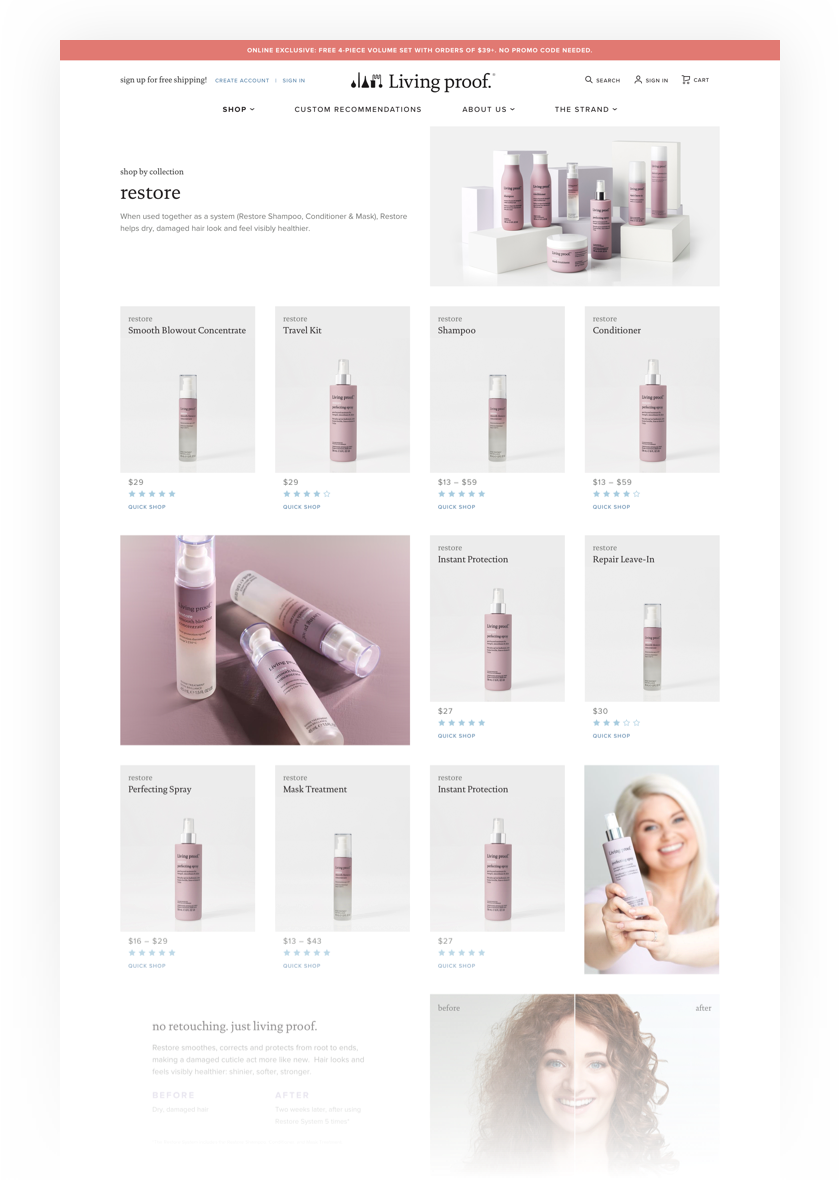
Create a Curated Experience

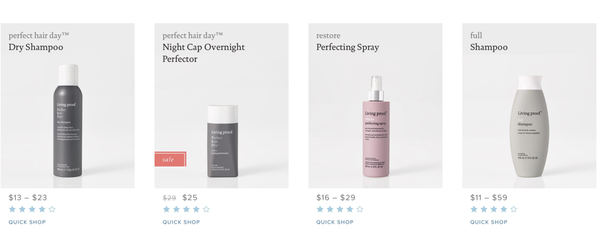
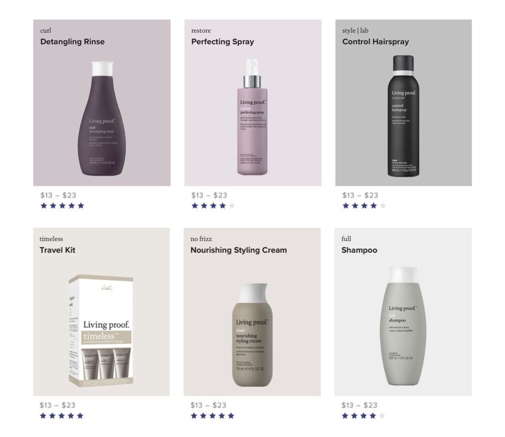
Rather than presenting a generic product catalog, the redesigned experience organized discovery around customers’ hair concerns and goals. The information architecture allowed shoppers to browse by category, concern, or collection, while simplified navigation centered around Shop supported by editorial content designed to provide guidance on compatible products and routines.

Living Proof browse by concern and collection interface
Living Proof curated collection page prototype
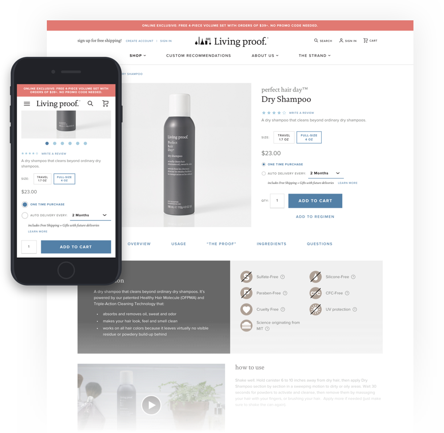
Living Proof product detail page

Turning science into an understandable product story

Research showed customers wanted clearer education around ingredients, product development, and the science behind how products worked, so the redesign integrated that content directly into the Product Detail page.

Product Detail pages combined core benefits with deeper layers of information, including ingredients and technology, usage guidance, supporting proof, regimen recommendations, related products, and richer imagery. This reflected competitive research showing that customers valued complete product information, as long as the most important selling points were prioritized and additional detail remained easy to access without overwhelming the page.

Designed while working at Blue Acorn

Back to Portfolio