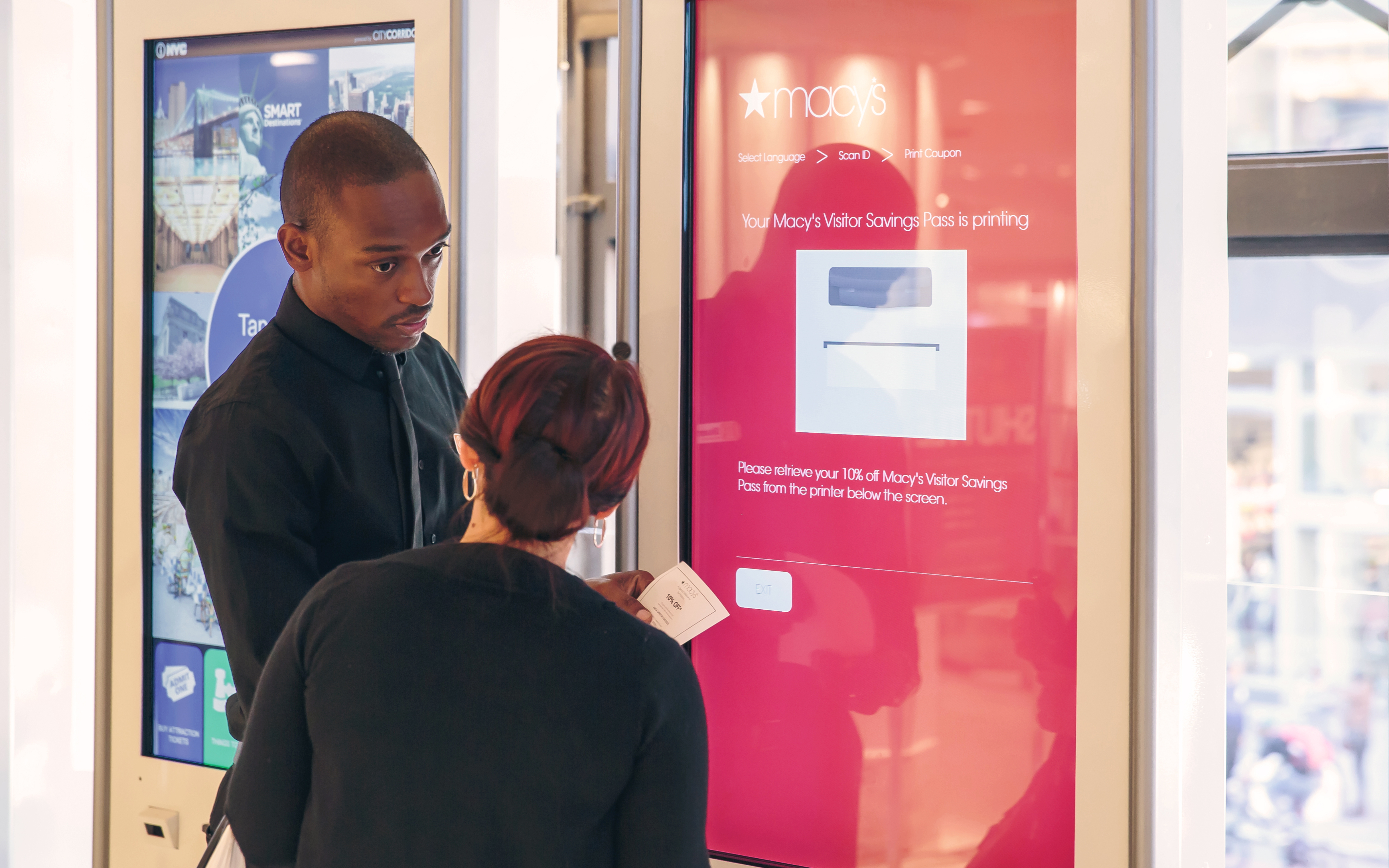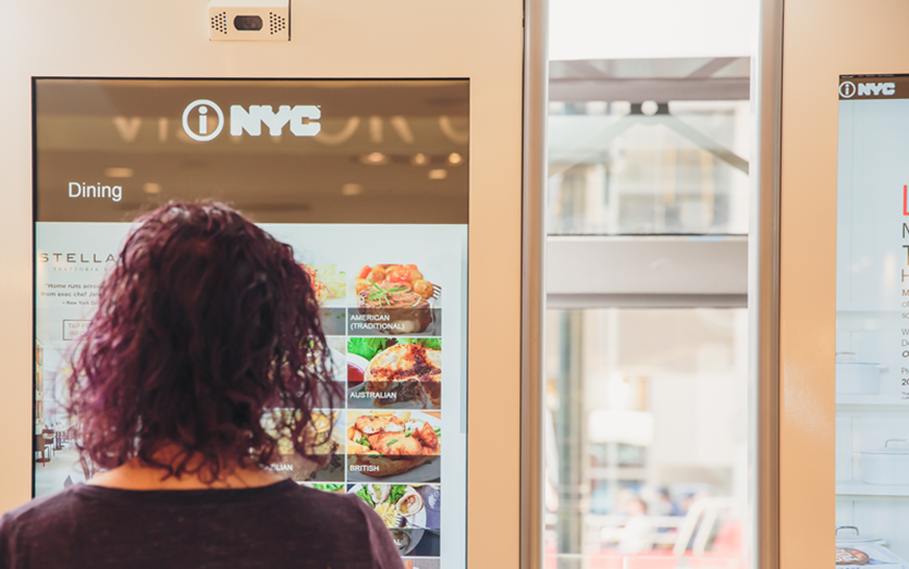
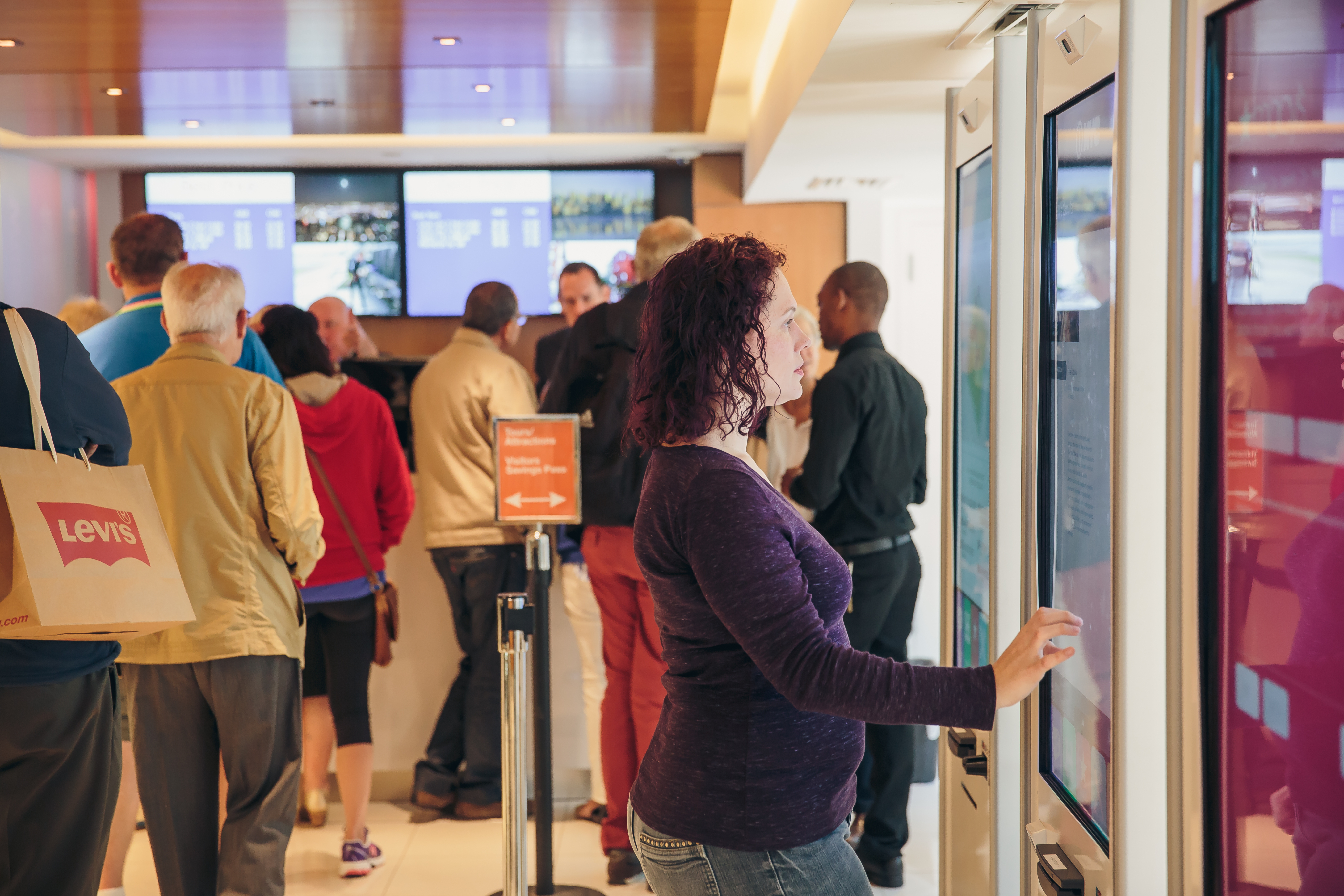
Visitors using a Macy’s touchscreen kiosk

Macy's

Digitizing Visitor Savings Passes

Distributing savings to millions of domestic and international visitors

2013 0→1 Design

  • Design Lead
  • Creative Direction
  • UX Strategy

Overview

Digitize a staple of the Macy’s Herald Square in-store experience

For one of America’s largest department stores, we developed a self-service solution to print discount coupons for foreign and domestic customers.

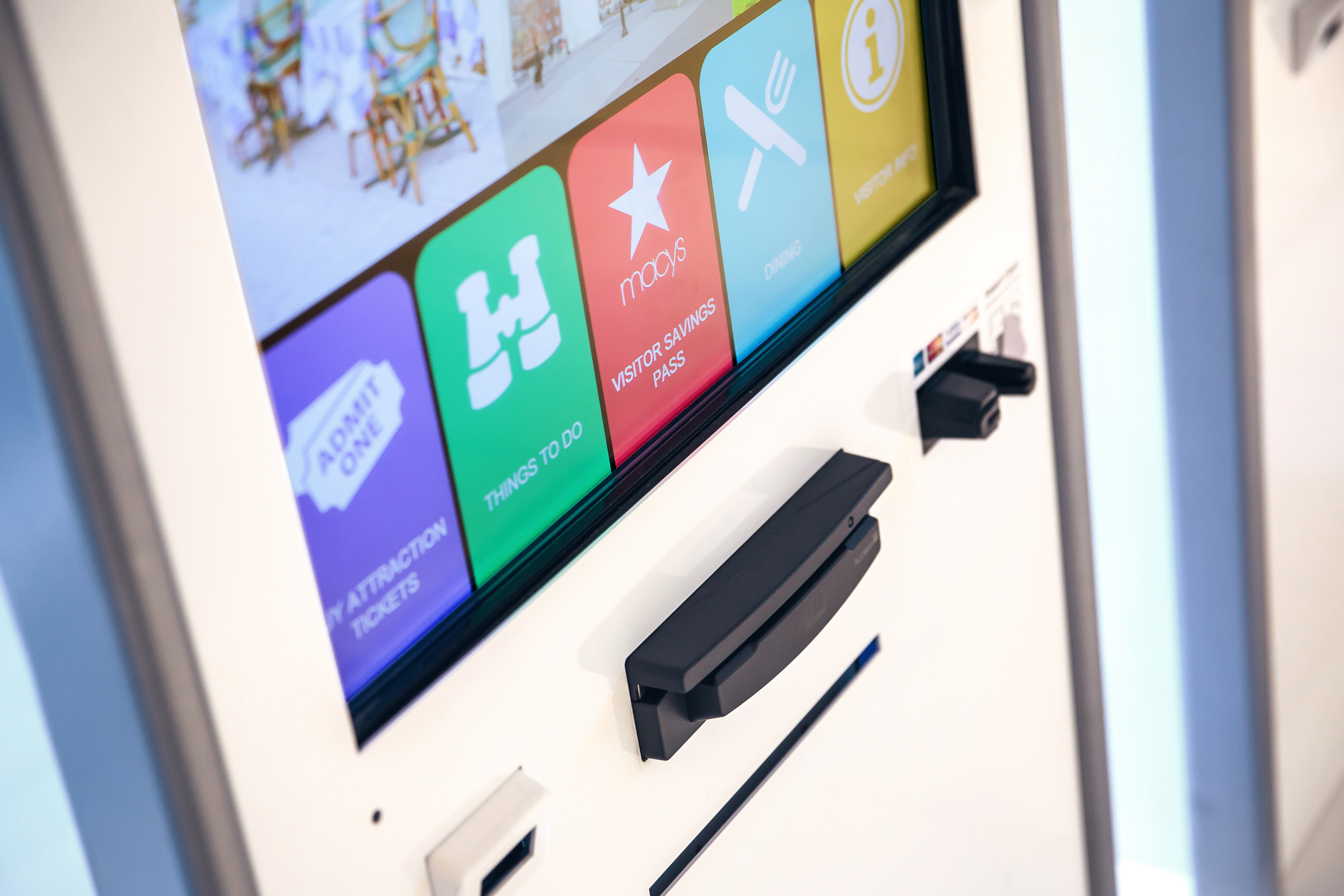
The Visitors Savings Pass flow was integrated into kiosks that also served New York City attraction, restaurant, and other helpful tourism information in partnership with NYC & Co.

Results

+1m

Visitor Savings Passes printed
(2013-2015)

+2

additional installations in Chicago's State Street and San Francisco's Union Square Visitors Centers

The Opportunity

Automate a manual process while creating visibility into a high-volume customer program

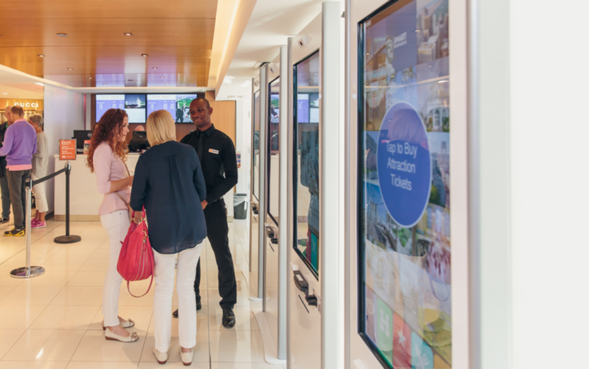
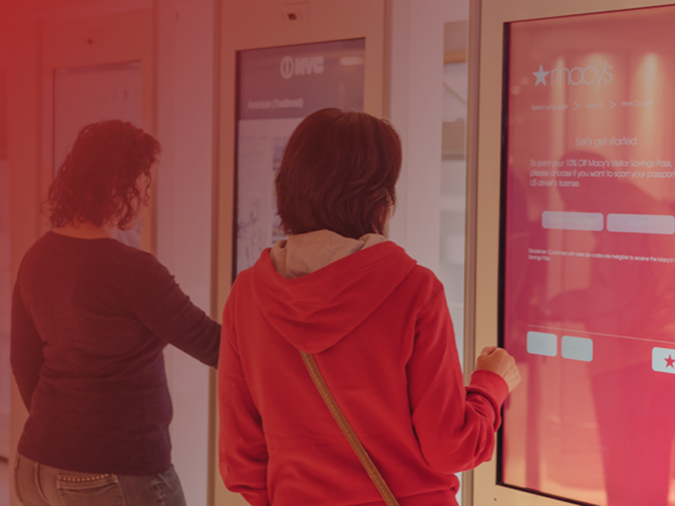
Visitors gathered around Macy’s information kiosks

City Corridor’s interactive kiosks were installed in the newly renovated Macy’s Herald Square Visitors Center, which served millions of domestic and international visitors each year.

One of the center’s most common services was the Visitor Savings Pass: employees manually verified a visitor’s identification, handed them a printed discount coupon, and moved on to the next customer. The process consumed staff time while giving Macy’s limited insight into exactly who was receiving passes or how frequently they were being distributed.

The opportunity was to translate that familiar interaction into a simple self-service experience. By allowing visitors to scan a driver’s license or passport, complete a short questionnaire, and automatically print their savings pass, Macy’s could reduce the operational burden on staff while gaining definitive distribution and audience data.

Key Design Decisions

  1. 1

    Large-form-factor interaction

    Controls, typography, interaction targets, and screen hierarchy were designed for quick comprehension at standing distance and comfortable use on a large touchscreen.

  2. 2

    Leverage familiar interactions

    Because the audience included visitors from around the world with varying levels of comfort using interactive kiosks, the experience relied on recognizable patterns, direct instructions, and a tightly constrained flow.

  3. 3

    Make Macy’s brand immediately recognizable

    The iconic Macy’s star and signature red were used prominently throughout the interface, creating a clear connection between the kiosk, the Visitors Center, and the broader Macy’s brand.

The Solution

0→1 translation of an analog experience

Converting the staff-assisted Visitor Savings Pass process into a self-service flow

We were intentional to design the experience with the minimum interactions necessary: identify the visitor, collect the information Macy’s needed, validate eligibility, and print the savings pass. The resulting experience allowed visitors to complete independently in minutes what had previously required assistance from Visitors Center staff.

The system also transformed an operational blind spot into a measurable customer touchpoint. Each completed interaction generated structured information about pass distribution and the visitors using the program, giving Macy’s audience insights that were difficult to obtain from manually distributed paper coupons.
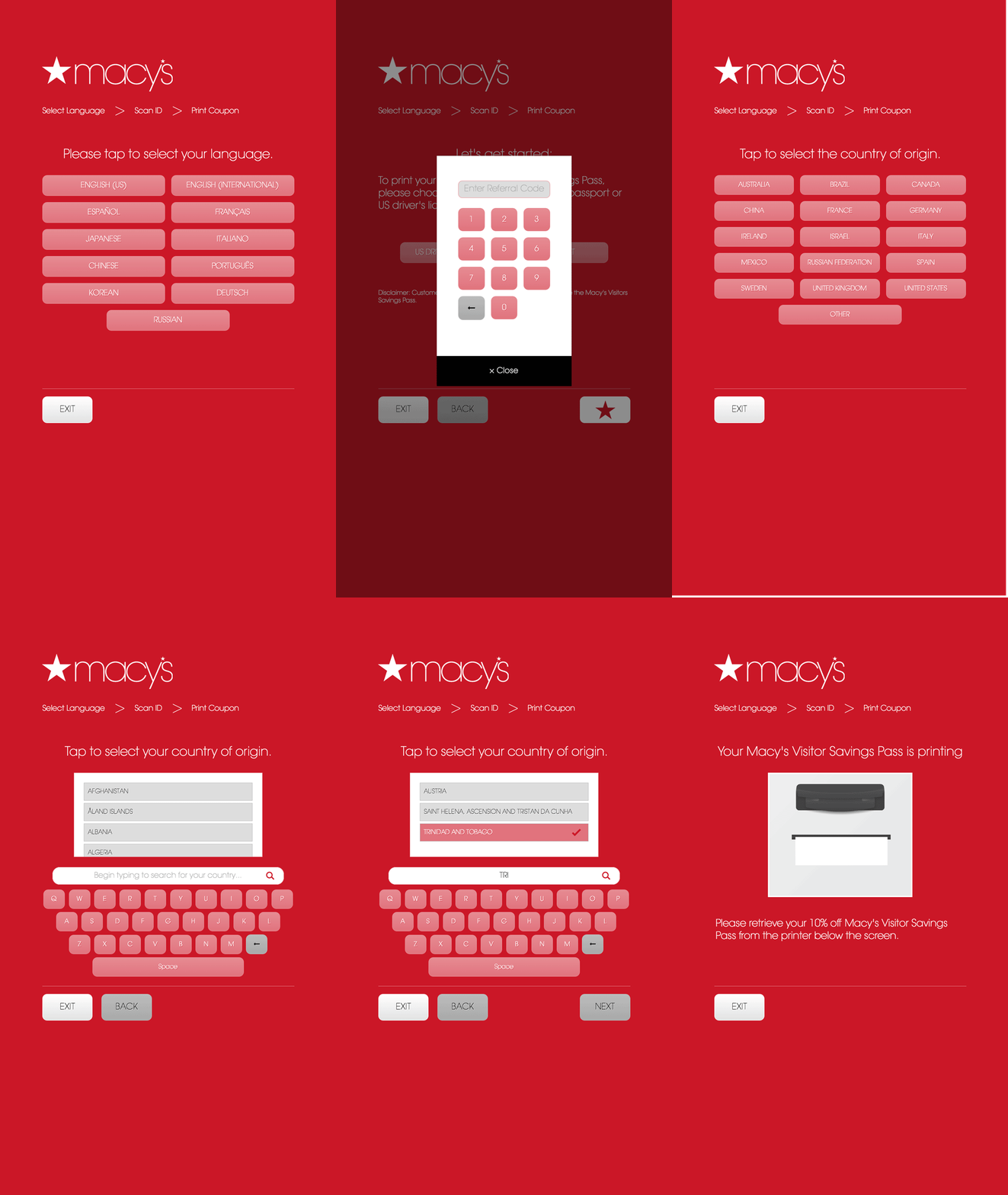
Macy’s Visitor Savings Pass self-service flow
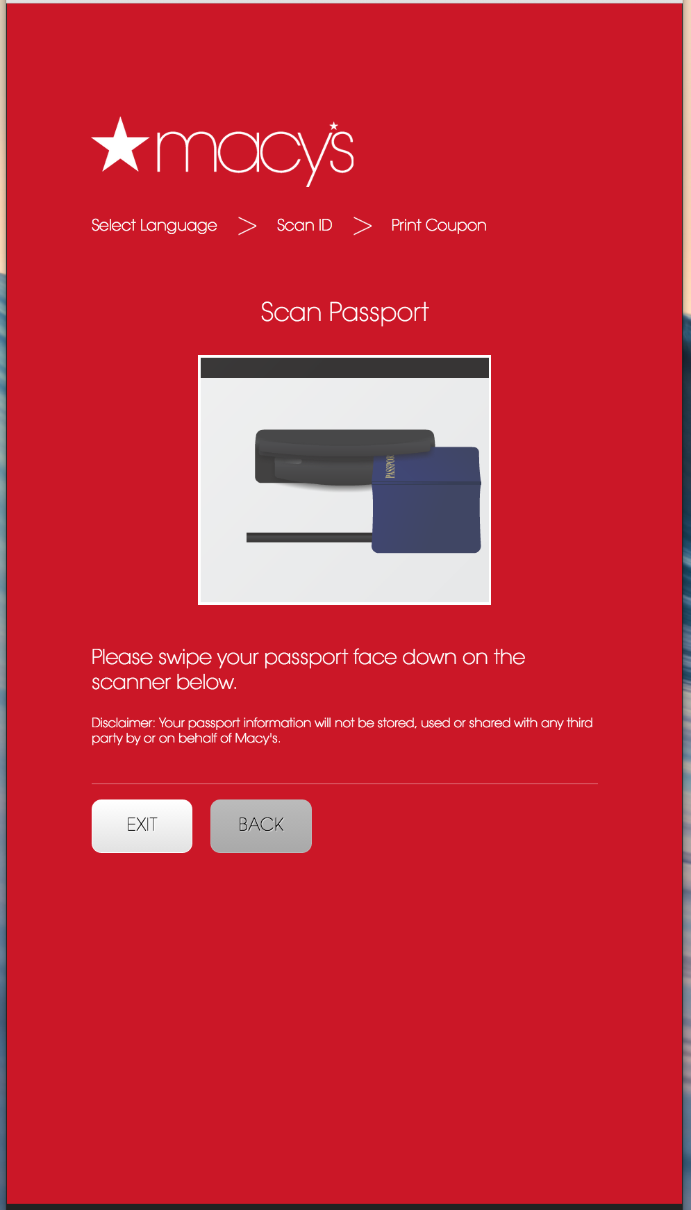
Document scanner guidance screen

Intuitively prompt users to scan identification documents

The experience began by asking visitors to scan a driver’s license or passport using integrated document scanners. Because these peripherals were unfamiliar to many users, the interface provided clear visual direction about what document to use, where to place it, and what would happen next.

Scanning the document both initiated the experience and reduced the amount of information customers needed to enter manually, keeping the interaction fast enough for a high-traffic retail environment.

Reduce the experience to a simple questionnaire

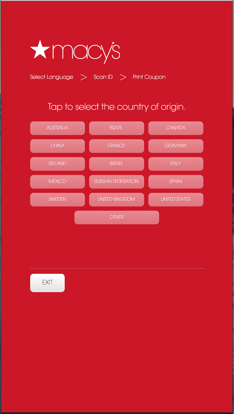
Once identification was captured, visitors moved through a short series of questions designed to collect only the information necessary to issue the savings pass and understand the program’s audience.

Large touch targets, limited choices, and one primary action per screen minimized cognitive load and made the flow approachable for a diverse audience of domestic and international visitors.

Macy’s kiosk questionnaire screen

Designed while directing creative at City Corridor

Back to Portfolio